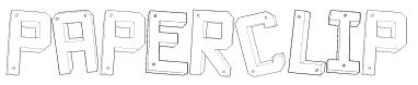
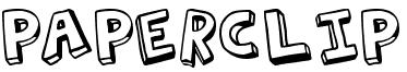
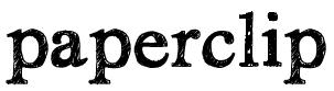
Title Ideas: ‘Paperclip’

For the opening title of our film trailer, our group was influenced by the conventional typography and fonts of previous Indie films. Usually these opening and title fonts take a playful and childlike approach to the film, regardless of the overall plot, showing a sense of light heartedness to the story or a show of creativity and freedom – a theme frequently visited in Indie films. These films often use a font as if it has been written personally by characters themselves, or that have been drawn or handwritten – which is the approach we have attempted to take when choosing a font for our title.
This font is extremely significant as it will be part of the central image and atmosphere of the entire film, so will often represent the film and the story behind it. Our group decided to choose a font by downloading from a font sharing website called dafont.com where we experimented with many other fonts by adding it to the ending of the trailer of our film. Our group chose arguable the most simple cartoon esthetic fonts, which can give the impression that it has been drawn by one of the two protagonists. It can also be symbolic, because it is a cartoon, of the entrapment that the protagonist feels and the liberation they seek in the wider world that surrounds them.
